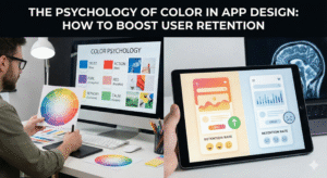
In the high-stakes arena of the mobile app market, you have approximately 50 milliseconds to make a first impression. Before a user reads a single word of your copy or clicks a single button, their brain has already made a subconscious judgment about your product. This snap decision is driven almost entirely by visual stimuli, and the most dominant among them is color. For app developers and product managers, understanding the psychology of color is not just an artistic exercise; it is a revenue-critical strategy.
Color is the silent language of your interface. It dictates where users look, how they feel, and ultimately, whether they stay or churn. While many think of “retention” as a metric driven by push notifications and feature updates, the foundation of long-term user engagement is actually emotional. If an app makes a user feel anxious (due to poor contrast) or bored (due to a lack of visual hierarchy), they will leave. Conversely, an app that uses color to reduce cognitive load and trigger positive dopamine loops becomes habit-forming.
To truly master retention, one must look beyond the screen and into the ecosystem of the brand. When a user transitions from a desktop browser to a mobile app, the visual language must be seamless to maintain trust. This is where high-quality custom web design plays a pivotal role, serving as the visual anchor that informs the app’s aesthetic, ensuring that the brand’s psychological triggers remain consistent across every digital touchpoint. If your web presence uses a calming slate blue to signify security, your app cannot switch to an aggressive bright red without causing cognitive dissonance that kills retention.
The Neuroscience of Retention
Why does color matter so much to the human brain? The answer lies in our evolutionary biology. Our ancestors used color to distinguish ripe fruit from poisonous berries and to identify predators in the grass. Today, we repurpose those same neural pathways to navigate digital interfaces.
When a user sees a notification badge, their brain processes the color red as “urgent” or “important” because red has the longest wavelength in the visible spectrum and appears closer than it actually is. This triggers a micro-dose of cortisol (the stress hormone), prompting action. Once the badge is cleared, the brain releases a small amount of dopamine (the reward chemical). This cycle—Cortisol -> Action -> Dopamine—is the biological loop that powers user retention.
However, over-triggering this system leads to “alarm fatigue.” If your app uses red for everything from critical errors to minor updates, the user becomes desensitized, or worse, annoyed. Sustainable retention in 2025 is about balance. It is about using color not just to scream for attention, but to guide the user into a “flow state” where navigating the app feels effortless and rewarding.
The 60-30-10 Rule: Structuring for Clarity
One of the primary reasons users delete apps is “cognitive overload”—the feeling that an interface is too messy or confusing. To combat this, successful designers rely on the 60-30-10 rule, a timeless interior design principle that has found a permanent home in UI/UX.
60% Primary Color: This is your neutral base. In modern apps, this is often white, light gray, or a deep charcoal for dark mode. It provides the “negative space” that lets the content breathe.
30% Secondary Color: This is your brand color. It creates consistency and identity. It is used for headers, active tab icons, and non-critical highlights.
10% Accent Color: This is your “Action Color.” It should be a high-contrast hue used exclusively for Call-to-Action (CTA) buttons, notification badges, and success states.
By strictly adhering to this ratio, you create a visual hierarchy that tells the user’s eye exactly where to go. The 10% accent color acts as a beacon. When a user wants to “Buy Now” or “Upload Photo,” they shouldn’t have to scan the page; their peripheral vision should already have locked onto the accent color. This reduction in friction is directly correlated with higher retention rates.
Decoding the Color Spectrum for Apps
Different colors evoke distinct neuro-associations. Here is how top-tier apps leverage specific hues to drive retention in different industries.
1. Blue: The Currency of Trust
Emotions: Security, Stability, Logic, Calm.
Industry: Fintech, Social Media, Healthcare.
The Strategy: Blue is the world’s favorite color for a reason—it is non-threatening and universally accepted. For an app like PayPal or Chase, retention relies on the user feeling safe. If a banking app used neon pink, users would subconsciously question its security.
Retention Tip: Use varying shades of blue to indicate hierarchy. A deep navy for the header suggests stability, while a vibrant electric blue for the “Send Money” button suggests speed and technology.
2. Green: The “Success” Loop
Emotions: Growth, Health, Money, Go.
Industry: Fitness, Finance, Eco-apps.
The Strategy: Green is the easiest color for the human eye to process. It is synonymous with “Correct” and “Complete.” Duolingo is a master of this. When you finish a lesson, the screen flashes green. This signals to the brain that a task has been successfully completed, releasing that dopamine hit we discussed earlier.
Retention Tip: Never use red for a success state. If a user saves a file and sees a red icon, they will panic. Use green for all positive reinforcement loops (completed streaks, saved money, weight lost) to condition the user to associate your app with personal progress.
3. Red & Orange: The Urgency Drivers
Emotions: Energy, Passion, Danger, Urgency.
Industry: E-commerce, Food Delivery, News.
The Strategy: These are “arousal colors.” They physically raise heart rates. DoorDash and Grubhub use red to stimulate appetite and create a sense of urgency (“Order now while it’s hot!”). However, they must be used sparingly.
Retention Tip: Use orange for “impulse” actions (like “Add to Cart”) but red for “destructive” actions (like “Delete Account”) or critical alerts. If you paint your whole app red, users will leave because the interface feels too aggressive.
4. Purple: The Luxury of Royalty
Emotions: Wisdom, Wealth, Spirituality, Creativity.
Industry: SaaS, Meditation, Gaming.
The Strategy: Purple bridges the stimulation of red and the calm of blue. It is often used to signal a “premium” experience. Apps like Calm or Headspace use soft lavenders to induce relaxation, keeping users in the app longer by lowering their stress levels.
Retention Tip: Use purple for onboarding flows or “Upgrade to Pro” screens. It subconsciously tells the user, “This is a special, high-value feature.”
The Dark Mode Revolution
In 2025, Dark Mode is no longer a feature; it is a requirement. Over 80% of users prefer dark mode in low-light environments. Ignoring this can be a retention killer. If a user opens your bright white app in bed at 11 PM and is blinded by the glare, they will close it immediately.
However, “Dark Mode” does not mean “Pure Black.” Pure black (#000000) on white text can cause eye strain due to smearing (ghosting) on OLED screens. The psychological fix is to use “Dark Gray” (e.g., #121212). This retains the battery-saving benefits and sleek aesthetic while being softer on the eyes.
Furthermore, colors behave differently on dark backgrounds. A standard saturated blue that looks great on white will vibrate and look blurry on black. You must desaturate your accent colors (add white/gray to them) to make them readable in dark mode. This attention to optical comfort prevents eye fatigue, allowing users to browse your app for longer sessions.
Cultural Context: The Global Retention Trap
If you are building an app for a global audience, you must respect cultural color coding. A retention strategy that works in New York might fail in Shanghai.
Red: In the US, it means “Danger” or “Stop.” In China, it means “Luck,” “Prosperity,” and “Celebration.” A stock market app in the US uses red for a drop in price; in China, red signifies a rise in price.
White: In the West, it is purity and weddings. In parts of Asia, it is the color of mourning and death.
Failing to localize your color palette can lead to immediate churn because the interface feels “wrong” or culturally offensive to the user.
Testing: The Only Truth
While color theory provides the roadmap, data drives the car. You cannot guess what will retain your specific users; you must test it. This is where A/B testing comes into play.
The Button Test: Try changing your main CTA from Green to Orange. Does the Click-Through Rate (CTR) go up?
The Background Test: Does a light gray background increase session time compared to a stark white one?
HubSpot famously tested a green vs. red button. Despite green being the color of “Go,” the red button outperformed it by 21% because it stood out more against their specific design. Context is king.
Conclusion
Color is not decoration; it is functional engineering. It serves as a navigational beacon, an emotional primer, and a behavioral conditioning tool. To boost retention, you must move beyond personal preference and design with the user’s brain in mind.
Start with a solid foundation—referencing your custom web design to ensure brand consistency—then apply the 60-30-10 rule to reduce cognitive load. Use color to build trust (Blue), reward progress (Green), and create focus (Dark Mode). Finally, never stop testing. The market shifts, and user preferences evolve. The app that stays relevant is the one that knows not just what users want to do, but how they want to feel while doing it. By mastering the psychology of color, you don’t just build an app; you build a digital habit that users are happy to return to, day after day.